Meet the ear doctor who thinks Vincent Van Gogh was murdered

There’s new conjecture that not only was Van Gogh murdered, he wasn’t shot, he was stabbed with a knife.

How did you get from “It couldn’t have been a suicide” to that?

WelI, I’m a doctor. [Records of Van Gogh’s death] do not have any description of a carbon-black gunpowder burn. Vincent couldn’t possibly have shot himself successfully and done it without getting a powder burn. No one saw the act. Nobody heard a gunshot. There was no suicide note. And there was no autopsy. It doesn’t compute. I’m trying to connect the dots, much like Oliver Stone did in the movie JFK.

In order for Vincent to have shot himself, the bullet would have had to make a significant turn inside of his body. There is no report that the bullet was ever found. As far as we know, Vincent died with a bullet in his body, so the bullet should still be in his body or his remains, or at least in his casket.

DEATH AT THE MANSION – The Final[e] Analysis [Part 2 of 3]

Many of those covering the Zahau case seem to be fixated on the knots, as well as demonstrating that they could be “self tied”. Personally I find the whole line of inquiry odd and unnecessary simply because there’s very little effort to replicate the exact bindings the way we see them in the crime scene photos.

In DEATH AT THE MANSION a fuss is made over the knot being at the top instead of at the bottom etc. It’s pedantic this late in the game to still be trying to prove it wasn’t suicide, but if you want to talk about the rope, look at how the rope is threaded under both the yellow and the black wristbands in this image.

Fullscreen capture 20190630 234318.jpg

Ironically, I used to wear two wristbands when they were vogue, a black one and a yellow LIVE STRONG bracelet. They’re snug, they can stretch a little, but it would be impossible to tie the sort of knots under two of these wristbands.

458505_414746738567138_2072702662_o

Remember Adam Shacknai saying he had to move “something” out of the way when reaching for Rebecca’s pulse? That statement always struck me as odd, and completely unnecessary to say. I’d assumed he was referring to the rope, but felt that didn’t make sense, because obviously he had to move the rope away. This seems to be a potential slip of the tongue. Whoever killed Rebecca had to navigate under those wristbands when securing her wrists together. That’s what had to be moved out the way and threaded inside and under, not once, but numerous times.

Fullscreen capture 20190630 234731

DEATH AT THE MANSION – The Final[e] Analysis [WARNING – GRAPHIC IMAGES] [Part 1 of 3]

It’s always difficult presenting graphic autopsy images in an appropriate way. There’s nothing “appropriate” about death, and so there’s no way to do this that doesn’t feel uncomfortable.

In True Crime the cadaver is often by far the most important source of evidence. It’s also the surest way to feel the scale and scope of a crime from the victim’s perspective. It’s shocking, and it should be. It should disturb us.

In DEATH AT THE MANSION the wound to Rebecca’s neck is shown. Without seeing this wound firsthand it would be difficult to appreciate the injury even with a technical description.

What we do see is a very severe asymmetrical gash caused by the rope into the right side of the neck [Rebecca’s left side]. This immediately suggests two scenarios:

  1. Rebecca was hanging in a lopsided fashion [similar to how she is seen laying on the lawn, and also with her head turned slightly].
  2. Rebecca seemed to have been dropped fairly rapidly to create the gash in the first place.

Fullscreen capture 20190630 230133

If we imagine Rebecca hanging “lopsidedly”, we see her knees bent upwards even though gravity ought to be pulling her legs down. It also means her head is turned at an angle that is at odds with how it should look if she had hung herself.

Fullscreen capture 20190629 115655.jpg

This suggests she was cut down not only to dramatize a theatrical rescue [even though she was clearly dead], but because if she had been found hanging, the unnatural position would immediately arouse suspicion. If Rebecca was killed close to 03:00, then, if she was hung relatively late, close to sunrise or shortly before Adam called 911, then her body may have had several hours to stiffen in the position she was bound and strangled in.

From the perspective of neighbor’s noticing something and alerting the cops before her murderer “was ready”, we can imagine leaving the staging of the suicide until the last possible moment. Does that make sense?

Although it’s debatable whether in practice law enforcement could have or should have done a reverse suicide staging in situ, if Rebecca was hung up again, this could have “proved” the above point – that immediately on sight, seeing her hanging, the cops would have realized the suicide didn’t look right. However significant tissue damage would have been incurred in such an exercise.

From the original Case File images, a black and white image presents a very different view of Rebecca’s face and neck than the autopsy photo. Her eyes are slightly open and her mouth wide open either from the shirt stuffed in her mouth, or Adam performing CPR or both. Contrast her mouth with the above image where her lips are obviously closed.

The use of the shirt might also be to conceal or minimize the ugliness of the hanging wound after the fact.

Fullscreen capture 20190630 230958


Nahida Manzoor “Summit Photo”: Liespotting and Crooked Photospotting – it takes a keen eye [and ear]

At first glance, one can be forgiven for assuming there might be two different people in these summit photos. Summit Photos on Mount Everest are a dime a dozen. Everyone sort of looks the same, the setting is similarly snowy but basically nondescript. Even the climbers might as well be wearing burkas – they’re usually almost impossible to identify behind their gas masks and sun visors. The main indicator tends to be the color of their suits and the signs they hold aloft identifying who they are and where they are.

It’s precisely because of these limiting factors that summit photos are so easy to fake. So it’s not surprising there’s a storied history when it comes to fake Summit Photos on Mount Everest and faked ascents in general.

After Faking ‘Historic’ Everest Climb, This Couple Was Banned From Nepal Mountains – Huffington Post

Photoshopped images, false claims: Everest ascents too easy to fake? – Hindustan Times

Most brazen Photoshop fakes we’ve ever seen – Metro

FAKING MOUNT EVEREST? – Adventure Alternative

Yes, This Photo from Everest Is Real – Outside

Three Indian climbers make fake Everest summit claim? – The Himalayan

Swiss Climber’s Feat Honored Despite Lack of Proof – The New York Times

Let’s take a closer look at Nahida Manzoor’s effort here, just to get an idea how much work went into this [or…ahem…didn’t].

Fullscreen capture 20190627 115842

The first indicator that this is a staged photo is the basic layout. Same flag, same bent poster [same size, same bends and creases] and, though less easy to see in the cropped version, the climber is in the exact same position too. Look at the angle of the right leg compared to the left in both images.

Looking closer the fakery becomes a lot more obvious.

Fullscreen capture 20190627 113116

All the idiosyncrasies in Bhawna Dehariya’s image are repeated in Manzoor’s. Moving from top to bottom and left to right:

  1. The crease in the Indian flag, and the angle of orange streaking downward is identical.
  2. The angle of the orange part of the flag touching against the climber’s shoulder is the same in both images.
  3. The angle of the opaque container jutting out beside the climber’s cheek is the same in both images.
  4. The ridge of snow in the background is the same, and photographed from exactly the same angle.
  5. To the left of the poster is a small piece of triangular collar from the climbing suit jutting out. This is the first indication of mischief, where the original climbing suit has been clumsily edited out and replaced with a red suit. Notice how fuzzy the red suit is compared to the original suit in the original image.
  6. The edge of a green plastic thingy beside the gloved hand of the climber is almost cropped out, but not quite.
  7. Notice how the black gloves – both of them, in both images – are identical.
  8. A black zip tag protruding perpendicularly is visible in both images on the underside of the right-hand glove.
  9. All four corners of the poster are uniquely bent in both images.
  10. A black strap, possibly part of the climbing suit belt, protrudes from the same area at the same angle in both images.
  11. Ditto a yellow prayer flag.
  12. A line of red rope emerges in shadow beneath the poster. The image is deliberately cut off where the rope enters the sunlight, and to remove the idiosyncratic climbing gear in the foreground.

That’s 12, that’s enough.

There is one more aspect to point out, arguably, the most obvious of all: the script on the poster. It lists half a dozen sponsors. The names of the sponsors are just about bigger than Manzoor’s name and EVEREST 2019 which is telling, isn’t it?

Fullscreen capture 20190627 123654

In mountaineering the stakes are high, and the higher the mountain the higher the stakes. Lives, reputations and fortunes are often at stake. Manzoor obviously felt pressure from her sponsors, especially the Department of Tourism, to give them their due publicity-wise, no matter what. One wonders whether the DoT put Manzoor up to it, or pressured her to do it, or whether Manzoor did this entirely at her own initiative.

Over the course of writing the NEVEREST series [a trilogy dealing with the deadly ’96 Everest disaster as a crime scene], and climbing Kilimanjaro myself in the mid-90’s, I’ve experienced the lack of ethics and honesty on mountains firsthand. What ought to a theater for heroism often turns into a Lord of the Flies fest. The New York Times recently likened Everest to a zoo. And each year it’s getting worse.

In 2016 I worked with the world famous and much beloved Alpinist Ueli Steck, nicknamed “the Swiss Machine”. Although Ueli undoubtedly achieved dizzying achievements in mountaineering, there remains some doubt and controversy about whether one of his most amazing – on Annapurna – actually happened.

…in October 2013, Kelly McMillan reported for the New York Times that, “Steck didn’t have a photo of the summit; his altimeter had broken during his ascent; and he hadn’t used a G.P.S. tracker, all of which are accepted means of documenting such a climb…”

Watch Ueli Steck’s Ascent of Annapurna’s South Face – Climbing


Why it’s Obvious the McCanns’ “Last Photo” is Fake

According to the McCanns, this is the last photo of Madeleine – taken hours before she was snatched, on the day she was snatched: May 3rd, 2007.

image004-1

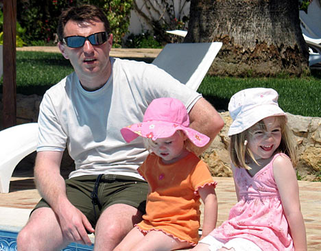
But it’s more likely this is the first photo taken at Praia da Luz of the little girl on holiday. In other words, it was probably taken on April 28th within a few minutes of their arrival from the airport, or the next day, April 29th, at the latest.

Look at Gerry McCann’s skintone on his face and hands on May 4th:

gettyimages-832988112-2048x2048

zz0505d

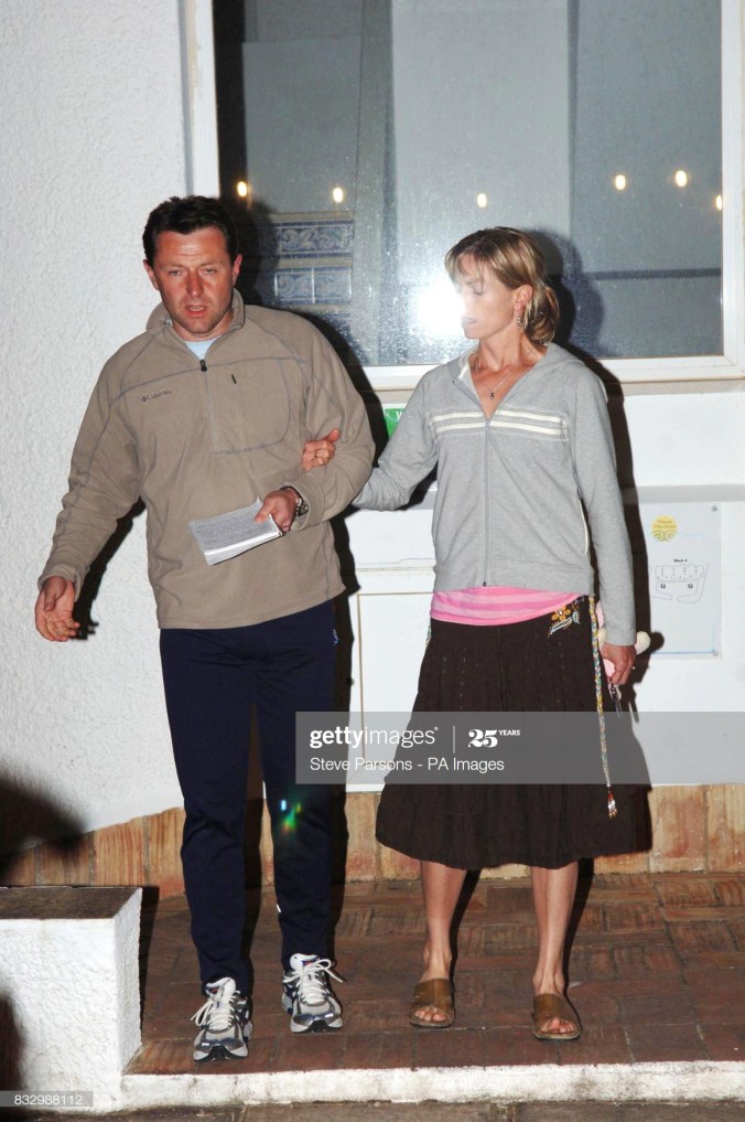
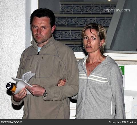
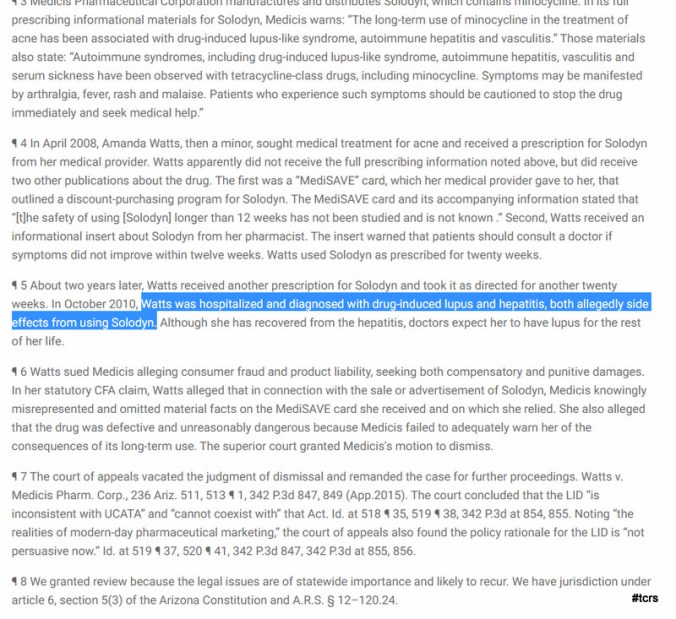
Gerry McCann on May 18th, 2007 [below]:

p9_zps49ca7670

If the last photo is fake, why is it fake? There are a few reasons why this photo may be chosen as the “last photo”. The most important is that Madeleine appears happy. It’s a “happy family photo”. If this photo wasn’t taken at the end of the holiday, then it suggests there weren’t photos of Madeleine later on in the trip where she appeared happy, or in a “holiday” setting. This would in turn raise worrying possibilities – that for whatever reason, the children, the family, weren’t getting along as well as they should. And this in turn might turn into concern about things like sleeping habits, the child’s behaviour, discipline and the possibility of parents sedating their children at night.

All of these, incidentally, were issues raised by the Portuguese cops.

So the Last Photo is a big deal. If the Last Photo isn’t what it purports to be, what else is a misdirection?

I’m not convinced Gerry is wearing the same shirt at the Ocean Club pool as he was on the bus. The tone is slightly greyer and lighter, and the sleeves seem longrt, and more creased. It’s not impossible though.

Madeleine [and Amelie] have clearly changed their clothing from what they wore on the flight from East Midlands Airport:

11024328-0-image-a-25_1552639488087

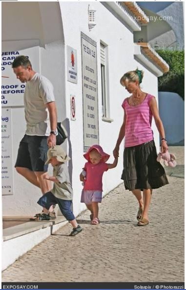
But the aspect I want to highlight is the most obvious. Why are the skins of all three people in this image so pink?

image004-1

If the McCanns arrived on April 28th, then this image was taken on Day 6 of their holiday. It sure doesn’t look like they’ve been on holiday in the Algarve for 6 days, does it?

I traveled to Praia da Luz this year, arriving on the night of May 1st. By the end of Day 1 I’d already gotten a hectic sunburn to my neck and arms. The skin wasn’t merely a tone or two darker, it had actually burned red on the first day. This was despite flying in from South Africa, at the end of a summer there.

Although I’d brought a cap for the sun, and the weather in early May in the Algarve is fairly mild, a few days later I bought a wide-brimmed straw hat [I still have it] and Factor 50 sunblock. In no time at all I’d developed a sandal tan on my feet, and a short sleeve tan. Though the nights are chilly the days in early May can be warm, and if one lounges in the sun, the sun can be blazing hot.

The three individuals pictured above look as though they’ve just arrived in Praia da Luz. They look as if its’s their first day in the sun, and the first time at the pool.

When I arrived the first thing I said to a guest on the first morning [she had come from the pool] was: ‘Is the water warm?’ Her answer: ‘Are you kidding?’

More: What to make of the “Last Photo” of Madeleine McCann?

Proof! The ‘Last Photo’ is Fake

https://www.amazon.co.uk/gp/product/B088PX4JHT/ref=dbs_a_def_rwt_hsch_vapi_taft_p1_i10